WellNest
a smarter, calmer way to manage healthcare.
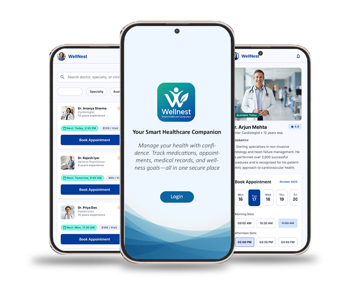
A patient-centered healthcare companion designed to turn fragmented health management into one connected experience.
How I would measure success.
These are target outcomes / success criteria for the concept, not measured post-launch production results.
The project in one story.
Situation
Patients were managing medications, medical reports and appointments across scattered channels. Research showed: 54% missed medication doses monthly, 41% skipped follow-ups, 22% understood their medical reports, and only 12% used one healthcare app for healthcare management.
Task
Design a centralized healthcare companion that simplifies medication management, medical records, appointments and caregiver coordination.
Action
Conducted secondary research, competitive analysis, patient portal audits, interviews with 10 patients and 3 caregivers, persona development, journey mapping, information architecture, user flows, wireframing, high-fidelity UI design and prototyping.
Result
Created a unified healthcare-management concept connecting records, medications, reminders, appointments and family support — with target success criteria of +30% medication adherence, −40% missed appointments, <30-second report retrieval, 85% satisfaction and +25% caregiver engagement.
Healthcare shouldn't feel like
detective work.
Patients struggle to manage medications, medical reports and doctor appointments because their healthcare information is fragmented across multiple channels.
None of these channels talk to each other. The patient becomes the integration layer — remembering, searching, forwarding and double-checking across all of them.
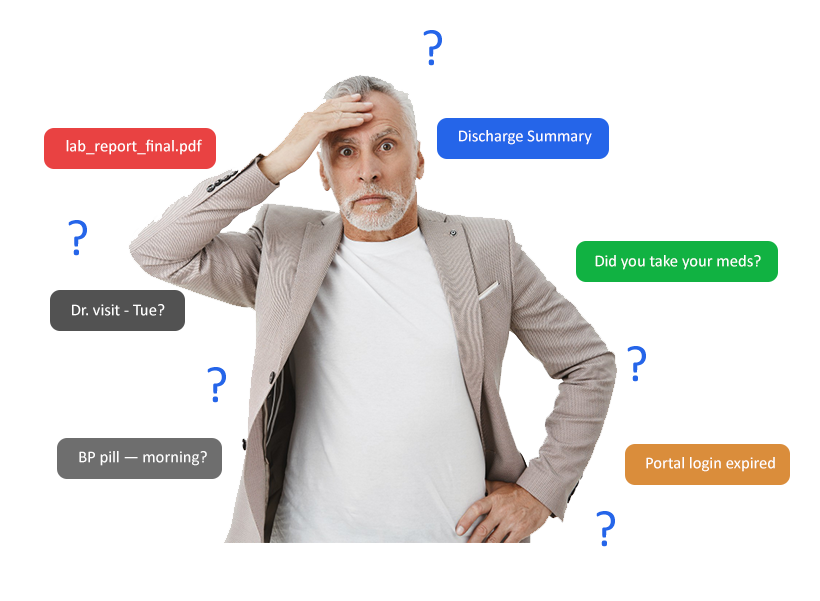
Fragmented healthcare
Connected healthcare
One calm home for medications, records, appointments, reminders and family support — designed around the patient, not the system.
Healthcare management is not one task.
Patients often need to remember medications, find medical reports, attend appointments, coordinate follow-ups and communicate with family members at the same time. The challenge becomes even greater for elderly patients and caregivers who manage healthcare remotely.


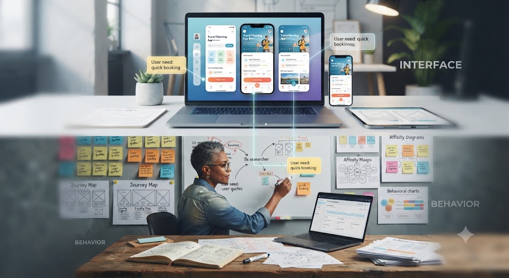
Before designing the interface, I studied the behavior behind the problem.
The goal was to understand how people actually manage healthcare today — the workarounds, the anxiety, and the invisible coordination happening inside families.
Existing products solved parts of the problem.
Each product owned one slice of the journey — but nobody connected appointments, records, medications and family support into a single calm experience.
| Product | Strength | Opportunity |
|---|---|---|
| Practo | Strong appointment booking | Weak medical-record management |
| Apple Health | Strong system integration | More passive experience |
| MyChart | Deep EHR functionality | More clinical / dense experience |
| Google Fit | Health-data integration | Limited comprehensive medication workflow |
Combine appointments + medical records + medication reminders + family/caregiver support into one cohesive experience.
From research to design principles.
Centralize
One place for important healthcare information.
Simplify
Reduce cognitive load and medical jargon.
Prioritize
Show what's important today rather than everything at once.
Support
Design for both patients and caregivers.
Reassure
Create a calm, trustworthy healthcare experience.
Empower
Keep patients in control of their information and permissions.
Designed for patients — and the people who support them.
Two recurring patterns emerged from the interviews: elderly patients managing chronic conditions, and adult children coordinating care from another city.
Meera S.
62 · Retired Teacher
- Hypertension + diabetes
- Four daily medications
- Needs simple reminders
- Prefers larger typography
- Wants family support
- Can struggle with small touch targets and medical jargon
Ravi P.
34 · Caregiver / Son
- Coordinates his mother's healthcare remotely
- Lives in another city
- Needs visibility into appointments
- Needs timely alerts
- Helps manage healthcare decisions
The research revealed four critical gaps.
Information was scattered
Reports lived across PDFs, emails, paper documents and different healthcare platforms.
Medication management was easy to forget
Of surveyed users reported missing medication doses monthly.
Healthcare information wasn't always understandable
Reported understanding their medical reports.
Caregivers needed visibility
Family members supporting patients remotely needed timely information without taking over the patient's experience.
From fragmented healthcare to a connected journey.
Ten stages, one emotional arc — from confusion to confidence. Scroll horizontally to walk the journey.

Simplifying the healthcare ecosystem.
Five primary destinations, each with a small, predictable set of features — nothing more than two taps away.
Today
Records
Reminders
Family
Profile
Making appointments feel connected — not isolated.
Booking is not the end of the flow — reminders, QR check-in and follow-up are designed as one continuous path. Teal marks the primary journey.
Wireframes

Meet WellNest - Hifedility Mockups
One connected place for the patient's healthcare journey.
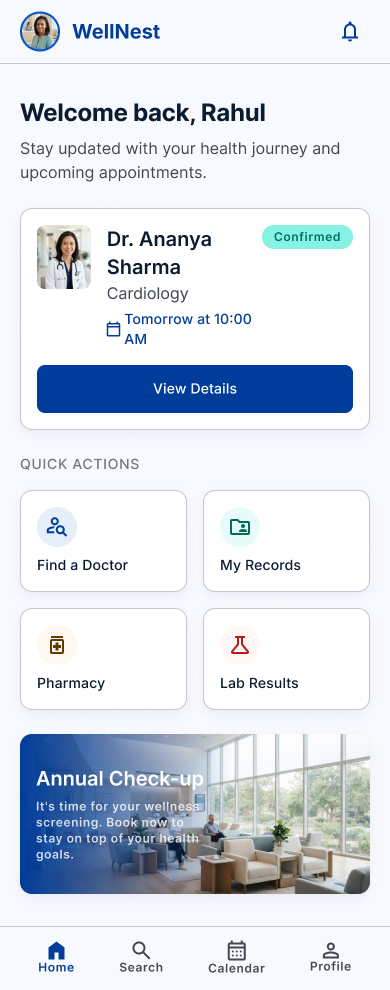
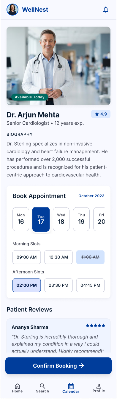
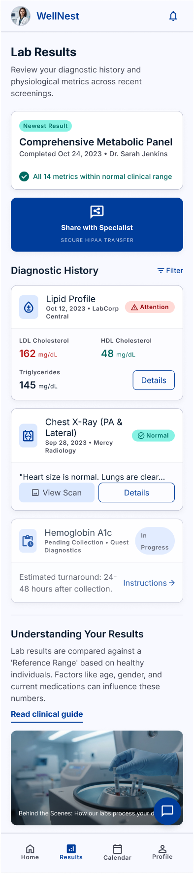
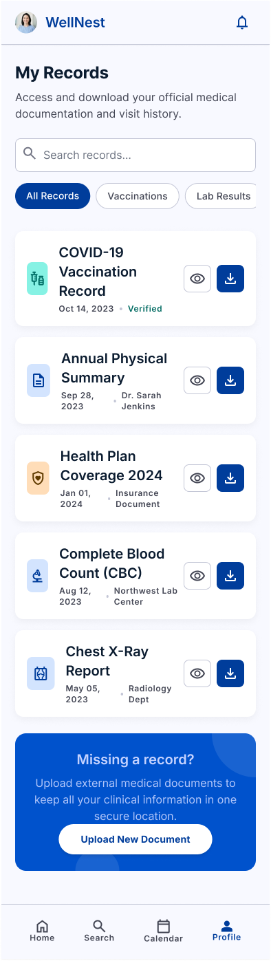
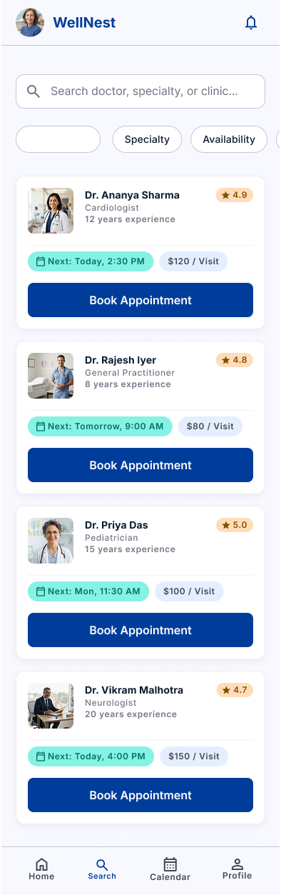
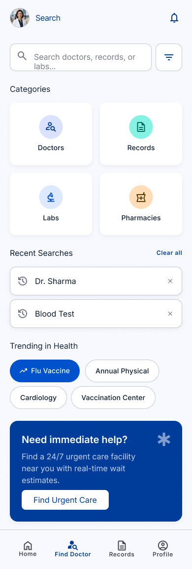
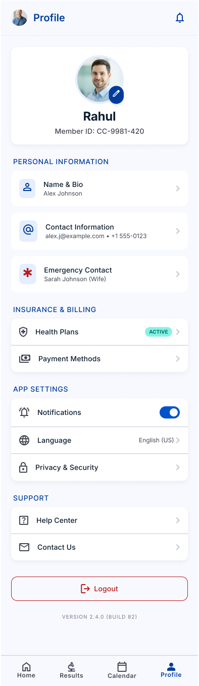
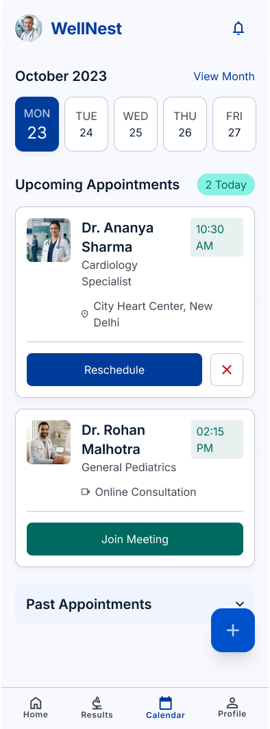
Less notification noise. More meaningful reminders.
Users often ignore excessive notifications. Instead of constant alerts, WellNest uses contextual reminders based on what matters to the patient — timed to the moment they can act.
From search to check-in without breaking the journey.
Every step hands context to the next — the booking creates the reminder, the reminder carries the QR code, and the follow-up lands back in Today.
A visual system built for clarity and trust.
A compact, systematic kit — every screen in WellNest is composed from the same small set of calm, consistent parts.
Plus Jakarta Sans
AaBbCcDd · 0123456789 · one family, eight weights
Avoid unnecessary visual complexity.
Approachable language and warm visual details.
Consistent spacing, components and hierarchy.
Designing responsibly for healthcare.
Healthcare design carries real responsibility. These considerations were treated as design inputs, not compliance checkboxes.
Accessibility
- WCAG 2.2 considerations
- Readable typography
- Large interaction areas
- Clear language
- Reduced cognitive load
Privacy
- Patient control
- Permission-based caregiver access
- Secure authentication considerations
- Sensitive health-data protection
Indian Healthcare Context
- Digital Personal Data Protection Act, 2023
- Ayushman Bharat Digital Mission (ABDM)
- Healthcare data privacy
These are design and implementation considerations for a real-world product, not certification claims. WellNest is a conceptual UX/product design project and is not presented as a legally certified healthcare product.
WellNest is more than an appointment app.
Every element feeds the next — a continuous healthcare-management loop instead of a stack of disconnected tasks.
One connected system instead of multiple disconnected healthcare tasks.
From healthcare chaos to clarity.
- Scattered records
- Missed medications
- Missed appointments
- Caregiver uncertainty
- High cognitive load

- Centralized information
- Contextual reminders
- Connected appointments
- Family visibility
- Calmer experience
What I contributed.
What I learned.
Healthcare UX is about reducing anxiety, not just reducing clicks.
Good healthcare design is not only about fewer taps — it is about creating confidence and clarity at every step.
Designing for accessibility improves the experience for everyone.
Larger type, simpler language and clearer hierarchy — designed for Meera — made the product better for every user.
A good healthcare product connects tasks into a journey.
The value of WellNest comes from connecting records, medication, appointments and family support — not from any single feature.
WellNest reinforced my belief that strong product design comes from understanding the ecosystem around a user — not simply designing individual screens.